


 We’ve noticed that Hugh at Deep Ape has noticed that jjb3k at the Discussion Board has noticed that the cover art for the upcoming release of MST3K: The Movie has popped up at Amazon.
As several people have already observed, it looks like somebody easily spent a full ten minutes on it.
 ) to help our users cope with "trolls" and other commenters whom they find annoying. Go to our
I think it looks fine. What more do you want? That cluttered original theatrical poster?
I’m actually completely amazed that they didn’t use the original poster.
This fan-made DVD art is a hella lot better!
http://mst3k.joshway.com/previews/Extras/MSTMOV.jpg
I like it a lot. Simple and nice. Like Phillip said, who wants clutter? Although, Brandon’s link looks pretty decent. I still like the simplicity. If I could change one thing it would be the MST3K ball. That part ain’t quite right.
I like it…
I’m not terribly happy with it. It’s a really boring knockoff of the original box art.
Oh, hopefully a shot of the back will be available soon.
I doubt there is anything that will make an MST3K totally happy :)
It’s ok but the fan one would catch my eye much quicker in a store. I am a fan though and know the This Island Earth art.
Stil, people put work into that movie and it almost seems like they’re ashamed of the original artwork and the movie they riff. But what do I know about marketing? For all i know this will sell 10 times more through graphic mind control. And I’m all for that.
I like it.
I may be mistaken, but isn’t that a Joel era silhouette?
It could be joel or mike or joike :)
I pre-ordered this at Amazon. I cant wait to get this. Funny how This Island Earth is 84 minutes but MST3K the Movie with TIE is 74 minutes…
They should have just done the whole movie.
I can’t complain too much. At least it was re-released. With the huge copy right issues involved with MST3K it a wonder that any episodes get released at all.
I like it. looks clean and nice, and is a Hard Case as opposed to the crapy cardboard of the previous release.
This is really embarrassing, but the first time I saw the dvd art, I thought, “Man that looks really cool!” Now everyone’s harping on it like it’s the worst thing ever. I’m just glad I didn’t leave a comment last night or everyone would… er… oops.
Not *everyone* is harping on it. I see plenty of positive notes. (Mine included.)
I also want to point out the *possibility* that this isn’t the final artwork. Some companies send out simplified art that is meant to look better in ads (where it may be reduced) and the use of this faux MST3K logo *could* be because of that.
Not saying it’s the case, of course, but something to think about…
And I want to point out that I personally like the cluttered theatrical poster. I even own an original. But as a cover for a commercial DVD release, it leaves much to be desired.
I agree about the theatrical poster.
Movie posters are usually more abstract or mysterious than DVD art, which typically lean towards the “Big picture of Angelina Jolie’s head” variety. David Chen wrote an interesting article on the subject called “Why Do Great Movies Get Awful DVD Cover Art?”
But yeah, this DVD art is far from awful. Especially considering the previous DVD art had a cheesy white glow around the silhouette, just to make it visible. I’ll prefer a pretty blue nebula any day. It kinda reminds me of Darkstar. ;)
I do graphic design for adverts (not saying I’m an expert, because truly… I am nothing close to expert.) but one rule I personally try to live by in advertising art is “Less is more.” The whole “Keep it simple, stupid” thing ACTUALLY works, and tends to make things look a LOT nicer and sleeker than cluttered messes when people try to get a bit TOO “creative”
Just my two cents. I like it.
Who cares what the art looks like? We’re getting the movie again!!!!!!!!!!!!!
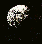
:neutral: That’s really disappointing. I think they should have some more with it, like at least make the planetoid look like the original one from the show, or include “This Island Earth” on the cover, or SOMETHING. Maybe the back looks better…?
The only thing about I don’t care for is the font used for the movie title.. it’s just a bit too plain and boring (nothing against Futura, really). I’d much rather they just use the actual MST3K logo, it’s much more visually interesting. The rest of the design doesn’t bother me, clean and simple is fine.
At least it isn’t as bad as a lot of dvd artwork. The Star Wars movies are a great example of how not to do dvd artwork. You have the great beautifully painted movie posters that Drew Struzan painted, and for the dvd release you create horrible photoshopped pieces that look like a 10 year old made. Sigh..
Give me the new MST3K artwork any day
This is an obvious case of the people who did the art not “getting it.”
They saw the big styroball of the MST logo and thought UGLY. So they reproduced it, and in their opinion improving it in the process. oblivious to the ironic production values that served MST3K throughout its run.
Did anyone ever notice how often they release really good “preliminary” art for DVD covers (often with the caveat of “not final art” slapped on the image) , and then wind up releasing a piece of garbage design that looks like some first year graphic design student who is just starting to learn Photoshop did it in fifteen minutes? That’s because they take the wonderfully designed cover art and show it to focus groups full of average people who have no design sense who say things like “it’s too cluttered”, or “I wish it were more simple”. And so we get 95% of the DVD covers released with giant horribly Photoshopped images of the films stars slapped on the front instead of them just using the original poster artwork or some other more interesting design. Like most DVD covers this design is TERRIBLE. It is extremely cheap and lazy design. Quick, simple, and with absolutely no interest in how it actually relates to the film it is for. It’s like they were simply given the title, a tag line that doesn’t really make sense on a DVD re-release for a ten year old movie, the generic silhouette image used on most MST3K promotion, and told it was about space. So they quickly photoshopped up up some stock photos of space imagery and slapped everything on top of it (using their high school level design sense to put drop shadows on the title! Oooh interesting use of the most overused technique on the face of the earth there) and were done with the whole thing in a couple of minutes.
I’m not particularly thrilled with this cover art either, but what caught my attention was the Rogue Pictures logo on the bottom. I wonder why this is being distributed under that studio. Did all the Grammercy titles get re-released though Rogue Pictures or something?
Given the circumstances and all, I’m just glad it’s coming back out again on DVD. And I say that as a proud owner of the first DVD version. As long as it’s out their period, it’s a very good thing. :smile:
I don’t really care that much what the cover looks like, because I’m just happy to get the movie, BUT…
The MST ball bothers me. I’d much rather have the original than this Venus radar image covered with boring, ugly text font.
@ cornjob:
Or maybe people *with* design sense just like things to be simpler and clearer when they are on a 7×5 inch DVD cover and not a 27 x 40 inch poster. Not all layouts translate to all media.
And the tagline is still valid, regardless of the year. If it read “Hollywood made 146 movies this year and this is one of them”, I’d see your point. But I have no problem with it. It’s the official tagline of the movie, after all.
No, I think the design is fine. (And a quick count seems to indicate a majority here agree.)
But I *have* been thinking about one aspect of this cover art: the lack of This Island Earth imagry. It could very well be that Universal doesn’t *want* them using it. They may have insisted that Best Brains use the film, but they may not want to focus too heavily on the fact that they allowed one of their more cherished films to be mocked.
I have a full size of the original poster on my wall in a case, except at the bottom it says “ON VIDEOCASSETTE! (also on laserdisc)”
It hangs next to my Army of Darkness poster from probably Italy (Dino de Laurentis presents un film de SAM RAIMI!)
I’m actually glad there’s no imagery of This Island Earth on there. They could’ve tried to fool consumers new to MST3K into thinking they were buy that plain vanilla movie or something.
A larger Mike & the Bots is also a big strength IMO. It could use a small SOL orbiting the earth and (as many of us have stated) the official iconic (good word) MST3K spaghetti ball. I was looking at Vol 12 of the Rhino MST3K DVD sets and thinking how Rhino really got it right with that box. It had all kinds of clever humor on it. cluttered? Yeah! But a fun kind of cluttered. :smile: And I have to agree with the poster above that they most likely didn’t know what the deal was with this show. Any one of us posting here could be paid $100 and we’ve give them a design to be proud of. :wink:
Lame cover, a step-down from the original DVD (which simply used the poster art).
@Travis:
Um, no it didn’t…
Check out the differences here:
http://www.mst3ktemple.com/stuff-mem-tm.html
The “Double-sided one sheet movie poster” is the original theatrical poster. (It’s the one I have, sans the autographs, of course.)
The video cover uses the same art as the “Video release poster”. Is that the one you have, Thunder Dan?
ooh stop crying over the cover art..what don’t mst3k cry about ?? :)
I can understand being upset over
-The Killer Shrews goof
-No Stinger for Monstrosity/The Atomic Brain
-Joel on the cover art for a Mike Episode
-The Dead Talk Back problems on the DVD
But when it comes to just releasing a movie finally and its just box art, or when there is a minor blip on the DVD..I mean c’mon guys..
You cried when it was over 100.00 to buy on ebay, you cried that it probably wouldn’t ever come out again, but here it is finally MST3K the movie, and you are still crying, over sleeve art! Sleeve art !!
Frankly, there are worse things to be upset over and I am happy for everyone who has the opportunity to add this movie to their collection for 14.99 instead of 149.99
Even if the art was plain white with nothing but the words MST3K the movie, in pink with little elves on it , its all good, because its finally coming back for real and 5/6 will be a great day for all the fans of this show to own this movie….
Thanks Phillip. Some nice little treats at the link.
I have to say I’m not bowled over by the original poster art. I like the VHS box though. I own that one. And the 1st edition DVD. This new DVD will be different enough to make it feel kind of new and not yet another double dip for something. I hope the new transfer is considerably better. I though the original looked fine.
Re: -Joel on the cover art for a Mike Episode
I don’t think that’s ever happened, although Joel is referenced on the back of some Mike VHS Rhino tapes. Also the DVD menus tend to use a Joel shadowrama regardless of who’s hosting.
@Brandon:
I’m not home to doublecheck, but the SN DVD guide says that 515 – Wild Wild World of Batwoman and 517 – Beginning of the End feature Joel on the label art.
I alway thought that the ‘pointing guy’ was Mike in those silhouettes.
As for the DVD, I still have my laserdisc. I’ll probably get this, but I won’t be hell-bent like those who either have VHS only (factory or copied) or those don’t have it at all.
If I was planning on gazing at the DVD case for hour upon hour at a time, I’d be upset about this cover.
But I’m planning on watching the movie, so…. :wink:
*makes OK sign*
It stinks!
@GoldenTriange: “I alway thought that the ‘pointing guy’ was Mike in those silhouettes.”
It is. But Joel is featured on the spine and back of those two DVD, despite them being Mike episodes.
Tom Servos arms are too big. :shock:
Mike’s jowls are too big as well. :smile: Oh and his finger is misshapen!
Crow to Mike – “Hey, clean your fingers!” :razz:
@Rhindle (sorry this is such a long’un)
You say “simpler and clearer” and I say “generic, poorly executed, boring, and irrelevent”. As far as promotional imagery like movie posters go, a truly good layout WILL translate to most other media. When dealing with things like movie posters and DVD covers there are very few differences in what makes them good. A 7 x 5 DVD cover held at reading distance (as they are usually intended to be seen) is not very different than a 27 x 40 movie poster seen from a reasonable distance in a movie theater lobby (as they are usually intended to be seen). And actually none of that really matters as I’m not just talking about the layout, I’m talking about the DESIGN. No matter how you look at it this new DVD cover is a bad design. If I had presented something like this in even the lowest level design classes of the many I went through I would have had my butt torn to shreds in the critique, and rightfully so. It was very obviously hastily slapped together from generic stock photo imagery with no consideration as to what the imagery actually is beyond it being “space” imagery that is VERY loosely related to the film. It has a generic, ill-considered typestyle (and amateurish use of drop shadows as a quick and easy way to make the title stand out from the planet without actually putting any real thought into it) used in the inexplicably new “logo”, which itself is completely pointless given that there is already a very familiar and well designed logo they could have used. And worst of all it has absolutely NOTHING to do with the film it is portraying other than the raw words of the title and the use of the trademark silhouettes. It could be used for any MST3K related DVD with absolutely NO modifications other than a change of the words in the title and removal of the tagline. How on Earth could that ever be considered good design for such a specific release?
And this is all on top of the MANY other design flaws I could name such as…
The awkward placement of the “logo” far too close to the left edge, which is obviously due to wanting it to line up with Mike’s pointing in the silhouettes (though it actually doesn’t quite line up right and the pointing itself winds up looking awkward anyway), which just reveals how awkward the overly large and left leaning placement the silhouettes are. Anyone even vaguely familiar with the series (or willing to do a MINIMAL amount of research) would know that the smaller size and right hand orientation of the silhouettes is as much of a trademark as the silhouettes themselves, and using that to their advantage would go far to help make the design work.
Then there is the amateurish blue haze around the silhouettes. It is just a thoughtless way of making them visible without having to actually adjust the design to make it work properly without such cheap tricks.
And there’s the awkward and confusing placement of the Earth next to the “logo”, which is either too close or too far away depending on how you look at it. I would make it larger and partially overlapped by the “logo”, but it could also be placed further away, more towards the right edge of the cover (though not as close as the “logo” is to the left edge). There is much more too. Need I go on?
I’m not saying that the original movie poster design doesn’t have it’s own problems, but it is infinitely better than this. This cover looks like a very early rough mock up, not a final design. If this is what the final DVD looks like when it comes out in May it will be a huge shame, and a huge embarrassment to whoever did it. It definitely won’t be making anyones portfolio any time soon. And as far as “the majority” goes I could care less. My sense of design and taste aren’t determined by a democracy. If I see a bad design I’ll say it no matter how many other random unknown internet people seem to not see it’s immense flaws. The person who did this isn’t a bad designer per se, but it’s painfully obviously that at the very least they didn’t care at all about it. And, as would be expected, the other people responsible for the DVD’s release obviously could care even less, as long as it is done cheap and fast. This may all seem pretty snooty, but I am a designer, and I’d hope that would give me qualifications over the average person to judge a designs true quality. I don’t know anything about guitar playing, so I wouldn’t presume to tell my cousin, who is a masterful blues guitarist, that a simple pop song I might like has guitar playing that is just as skillful as music he appreciates as being of high quality. That this cover might be passable to the majority of average people doesn’t forgive it’s glaring and numerous flaws. It is like the Brittany Spears of design. Cheap, meaningless, cliche ridden trash that meets the expectations of a lowest common denominator society, and doesn’t strive for anything more.
As for the tagline it worked as a joke twelve years ago, but it obviously was never intended as anything but a self deprecating joke for when the film was new. I doubt that when they wrote it they would have thought that twelve years later it would be treated as some sort of official tagline for the film, and be featured so prominently on a video cover. It makes very little sense in this context, and really has nothing to do with the actual film anymore, outside of that original promotional use.
Rhindle, I’m borrowing what someone else has already said….I spent more time reading your post than I will looking at whatever this cover happens to be.
What you had to say certainly makes sense. They should have just went with the original theatrical poster. This cover is basic and doesn’t capture more than 10% of what this TV show is all about and what it means to everybody who takes the time to post here.
//And the tagline is still valid, regardless of the year. If it read “Hollywood made 146 movies this year and this is one of them”, I’d see your point. But I have no problem with it. It’s the official tagline of the movie, after all.//
Hmm…”In 1996, Hollywood made 146 movies. This was one of them.” might have been a more dramatic-sounding (and therefore, funnier) tagline…
@radioman970:
That’s “cornjob” overthinking this issue (IMHO).
I’m fine with it.
Oops! I meant to direct that to Cornjob…
Overthinking, having good taste. Poe-tay-toe, poe-tah-toe.
Agreeing to disagree…being pedantic…
Being pedantic…gadding about the house all day.
…waitaminute, huh?
I have a repro of The Movie poster (But an original “Mitchell” Poster hanging over my bed :lol: ).
I don’t mind the cover, the only thing that bothers me is the logo, thats about it. The rest is fine.